


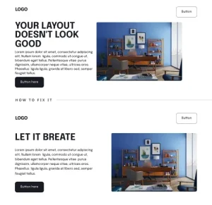
1. White spacing is important
If your layout sucks and everything is way too close and cluttered. it gets hard to move through the layout so just let it breathe, give some breathing room so that reading and making decision is easier for user.
2. Making Symbols Speak
Icons and words together make things easier to understand. Icons are like little pictures that represent something. this makes the design look clean, organized and interesting for user.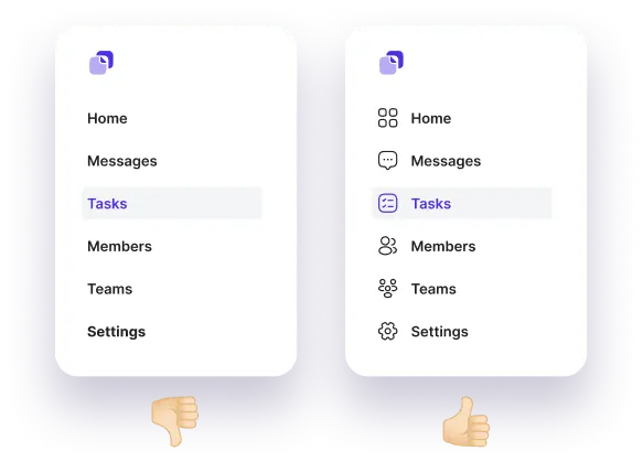
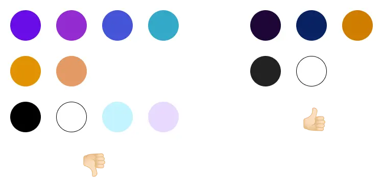
3. Avoid using pure black in your design
Say big no to pure black (#000000) and white (#FFFFFF) colors in your application or website because different mobile companies make many phones and each phone may have a slightly different color scheme, Using pure black and white for the interface might not look very interesting so instead of pure black you can use these colors according to your theme,

Why not to use pure Black?
According to research it is found that when someone read for extended period of time, pure white text on pure black background can cause eye stain.
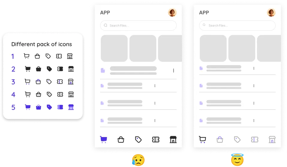
4. All icons must have the same style
let’s take a example of family photo: Everyone should look like they are related, right? In design, icons are like a family. make sure that Are they all thin outlines? Or maybe they’re all colorful and filled in? also don’t have some icons tiny and others giant! Keep them all roughly the same size.
5. Use proper colors with different mode
One set of colors might not work for both: A bright color that pops in light mode might be too hard to see in dark mode. The opposite is true too – a dark color good for night might disappear in the light, just like having different paint colors, designers should use different sets of colors for light and dark modes.

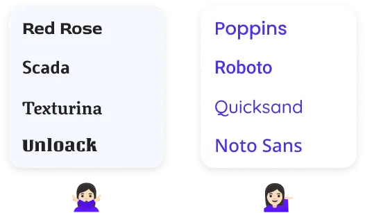
6. Use simple and popular font family
In UI design, the most important thing is that users can easily read and understand the text on the screen. Simple fonts are easier on the eyes and less likely to cause confusion, especially on smaller screens.
Popular fonts are familiar to most users, so they don’t have to spend any extra time trying to figure out what the text says. This creates an easy and intuitive user experience.
7. Use limited color palette: less is more
In UI design, the most important thing is that users can easily read and understand the text on the screen. Simple fonts are easier on the eyes and less likely to cause confusion, especially on smaller screens.
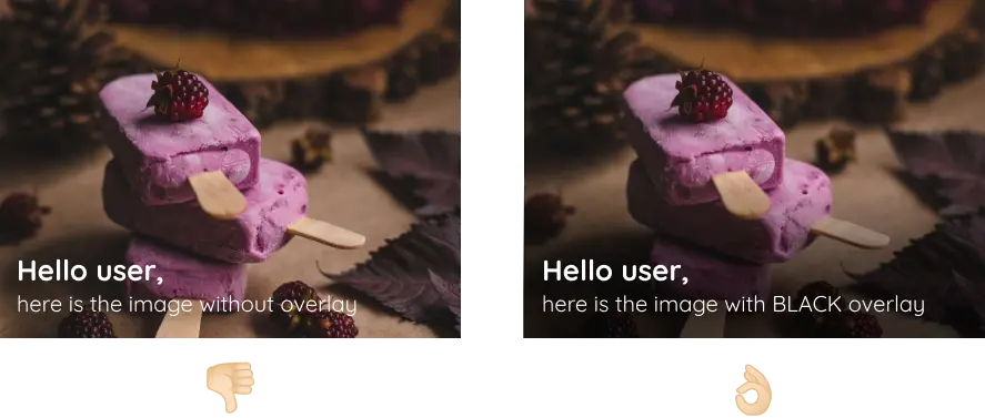
8. Overlays are a great way to improve readability
By adding a semi-transparent colored layer (the overlay) on the image, we can create a better contrast between the background and the text. This makes the text pop-out more and become easier to read for users. Common overlay colors include black, white, or a dark shade of the image’s dominant color.
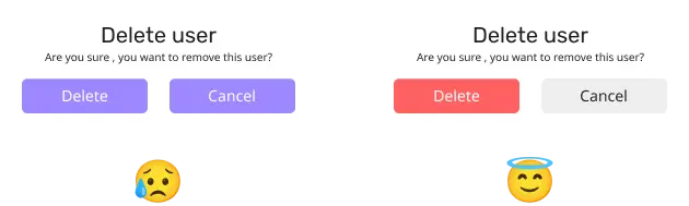
9. Colors affect human behavior & emotions
Different colors have different meanings and can evoke different feelings in people. For an example, red is often associated with love, passion, and danger, while blue is associated with peace, tranquility, and trust.
Color psychology can be used in a variety of ways, including marketing, design, and fashion. marketers may use red to attract attention to a product, while designers may use blue to create a calming and relaxing atmosphere in a room.
Important
Color psychology is not an exact science. The way that people respond to colors can vary depending on their individual experiences and cultural background.
10. Highlight the text that is linked
Don’t forget to highlight the text that is linked. Otherwise, user may not notice it at all. An underline makes them instantly recognizable, here purple color helps too. Avoid doing links that look like regular inactive text.

Conclusion
By prioritizing clarity, user-centricity and consistency, you’ll elevate your design game, impress your clients or employers, and establish yourself as a professional designer. Remember, clean design is an ongoing pursuit, but with dedication and these core principles in mind, you’ll be well on your way to creating exceptional work that stands the test of time.